

Theme features
Built from the ground up, Hugo Paradigm provides a completely new way of building pages using front-matter sections.
Section Builder
Below is a code excerpt (trimmed down) of the _index.md front-matter. Notice each of the - template sections. The sections are designed to be reusable sections and can be placed in any order. Each section comes with configuration dozens of options.
---
title: Home
date: 2020-03-22
headerTransparent: false
sections:
- template: hero
options:
theme: base
headings:
heading: "Hugo Paradigm"
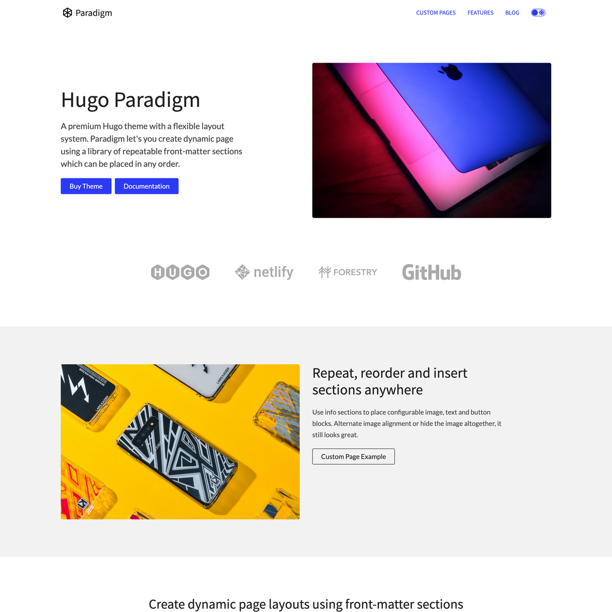
subHeading: "A premium Hugo theme with a flexible layout system."
alignHorizontal: left
image:
image: "/images/nastuh-abootalebi-yWwob8kwOCk-unsplash-800.jpg"
borderRadius: true
shadow: true
- template: grid
contentType: partners
sortBy: weight
align: center
columns: 2
card:
partial: card-image-only
- template: info
options:
theme: base-offset
heading: "Repeat, reorder and insert sections anywhere"
description: "Use info sections to place configurable image, text and button blocks.
Alternate image alignment or hide the image altogether, it still looks great."
align: right
image: "images/freddy-do-hgbyl2H0zRU-unsplash-800.jpg"
Key Theme Features
- Page builder like functionality using front-matter sections
- Fully responsive design
- Dark mode
- Fully themeable, edit the
themes.jsonto add new themes - 100 Speed / 100 SEO / 100 Best Practices / 100 Accessibility scores in Google Lighthouse
- SEO Optimised
- Configure dozens of settings in the
config.tomlanddata/layout.yaml
Content Types
Custom Page(Markdown + Front-matter Sections)- Homepage (uses Custom Page)
- Blog (Markdown)
Section Types
Insert these sections anywhere in a Custom Page
- Hero (Front-matter section)
- Info (Front-matter section)
- Grid (Front-matter section)
- CTA (Front-matter section)
- Content (Front-matter section)
CSS
- SCSS (Hugo Pipelines)
- Includes all SCSS files which are well structured and cleanly written
- Responsive design
- Bootstrap 4.3+ grid and media queries are used. The rest of the Bootstrap library is not imported. You can easily uncomment the @imports in the style.scss if you want to use more of the Bootstrap library.
Speed
- 100/100 Google Lighthouse Performance score
- Under 90KB without images ⚡
- Minified JS under 29KB
- Minified CSS under 27KB
- No JQuery
- No Boostrap JS
SEO
- Configure SEO settings in
seo.yaml - Google Analytics included
- Set the Google Analytics ID using Netlify environment variables
- 100/100 Google Lighthouse SEO score
- 100/100 Google Lighthouse “Best Practices” score
- Configure custom meta tags for the homepage and individual pages
- Auto generates meta title for each page, but can be overridden on a per page basis
- Semantic HTML document structure, h1, h2, p etc
Header
- Header animation on scroll
- Transparent header over hero images and backgrounds, turns white on scroll
Menu
- Main Menu managed in config.toml
- Nested dropdown menu compatible with Hugo menus
- Responsive menu using simple vanilla JS code
- Animated hamburger and mobile overlay
- 3 Footer menus which are configured in config.toml
Content
- Robust example content included out of the box
Blog
- Full blog. Contains categories, tags and author profiles
Fonts
- Uses Google fonts, edit the font in the
theme.yamland the theme automatically imports the Font from Google fonts!
Netlify
- Theme is ready to deploy to Netlify and contains a netlify.toml
Changelog
Version 1.4 (Released Feb 18 2024)
- Maintenance update
- Tested with latest version of Hugo
- Tested deploy with Netlify
- Updated docs
Version 1.3 (Released March 20 2021)
- Fixed bug where google analytics ID was not being set correctly
- Improved Google Fonts support. Now supports font weights. Now uses the new snippet and
preconnect. Google fonts load even faster (But control yourself, dont add to many! 👻 - Besides large images, Fonts are the biggest asset which will slow your site down) - Added transparent header mode, but not enabled by default
- Improved example content in
/custom-page-1 - Dark mode toggle is now inside the hamburger menu on mobile. Previously it was in the header on mobile and took up to much space.
- Ability to disable the hamburger menu and mobile menu. You can disable this in
data/layout.yaml>header.disableHamburgerMenu: false. This is for people who are builing 1 page sites. The hamburger menu and mobile menu are enabled by default. - Ability to configure the header height if you are not happy with the auto sizing. You can set this in
data/layout.yaml>header.headerHeight: '60px'. - Social media icons now use font-awesome. Icons change color between light/dark mode.
- Added hugo archetypes for each content type
- Improved blog card layout
- Improved pagination on blog
- Added Forestry
Version 1.2 (Released March 03, 2021)
- Update SEO meta tags. Improved the default meta tags and OG metadata. Meta tags now use the pages
.Title,.Params.descriptionand.Params.image. You can override the meta tags in any template using {{ define “meta_tags” }}{{ end }} and {{ define “title” }}{{ end }}. See the Blog layout for an examplelayouts/posts/single.html - Dark mode now detects users OS system preference.
- Fix bug where if dark mode was disabled in
data/layout.yamlthe preference stored in sessionStorage was still used.
Version 1.1 (Released September 13, 2020)
- Ability to disable dark mode toggle from
data/layout.yaml - Remove custom color overrides in favour of themed colors
- Dark Mode improvements
- Header bug fixes and refactor
- General cleanup of theme colors and themes.json
- Improve default card layouts, bug fixes
- Add more card configuration options in grid section
- template: grid
  contentType: features
  card:
    partial: card
    border: true
    padding: true
    shadow: true
    showThumbnail: true
    showThumbnailLink: true
    showFooter: true
    showTitle: true
    showTitleLink: true
    showDate: false
Version 1.0 (Released August 02, 2020)
- Initial release.