The Info section is used to place image and text sections. The alignment can be alternated. Can also display buttons.
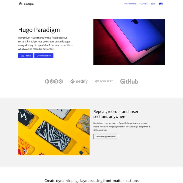
 2 info section with different background colors. First info section is aligned left, Second info section is aligned right and has buttons.
sections:
- template: info
  options:
    paddingTop: true # true/false
    paddingBottom: true # true/false
    borderTop: false # true/false
    borderBottom: false # true/false
    theme: base # "base", "base-offset", "primary", "primary-offset" - Uses color variables from `data/themes.json` to theme the section
    classes: "" # "my-class my-class-2" - Add custom classes to the section div for custom CSS styling
  align: left # "left", "right", "center" - Aligns the text and image
  heading: Better Performance
  description: Why wait for pages to build on the fly when you can generate them at
    deploy time? When it comes to minimizing the time to first byte, nothing beats
    pre-built files served over a CDN.
  image: https://source.unsplash.com/qtYhAQnIwSE/800x600y
  buttons:
  - button:
    text: Features # "Read More" - Text on the button
    external: false # true/false - Use when linking to other websites, the button will open in a new window
    url: "/features"
    theme: primary # "base", "primary"
  - button:
    text: Blog # "Read More" - Text on the button
    external: true # true/false - Use when linking to other websites, the button will open in a new window
    url: "https://www.zerostatic.io"
    theme: base # "base", "primary"
Designed and built by Rob Austin @ausrobdev in Brisbane, Australia. We stand on the shoulders of giants: Hugo | Jekyll